Brand Style Guide
The logo, colors, fonts and basic rules for anything made for The Stray Hare, including signs, social posts, print and the website.
The Logo
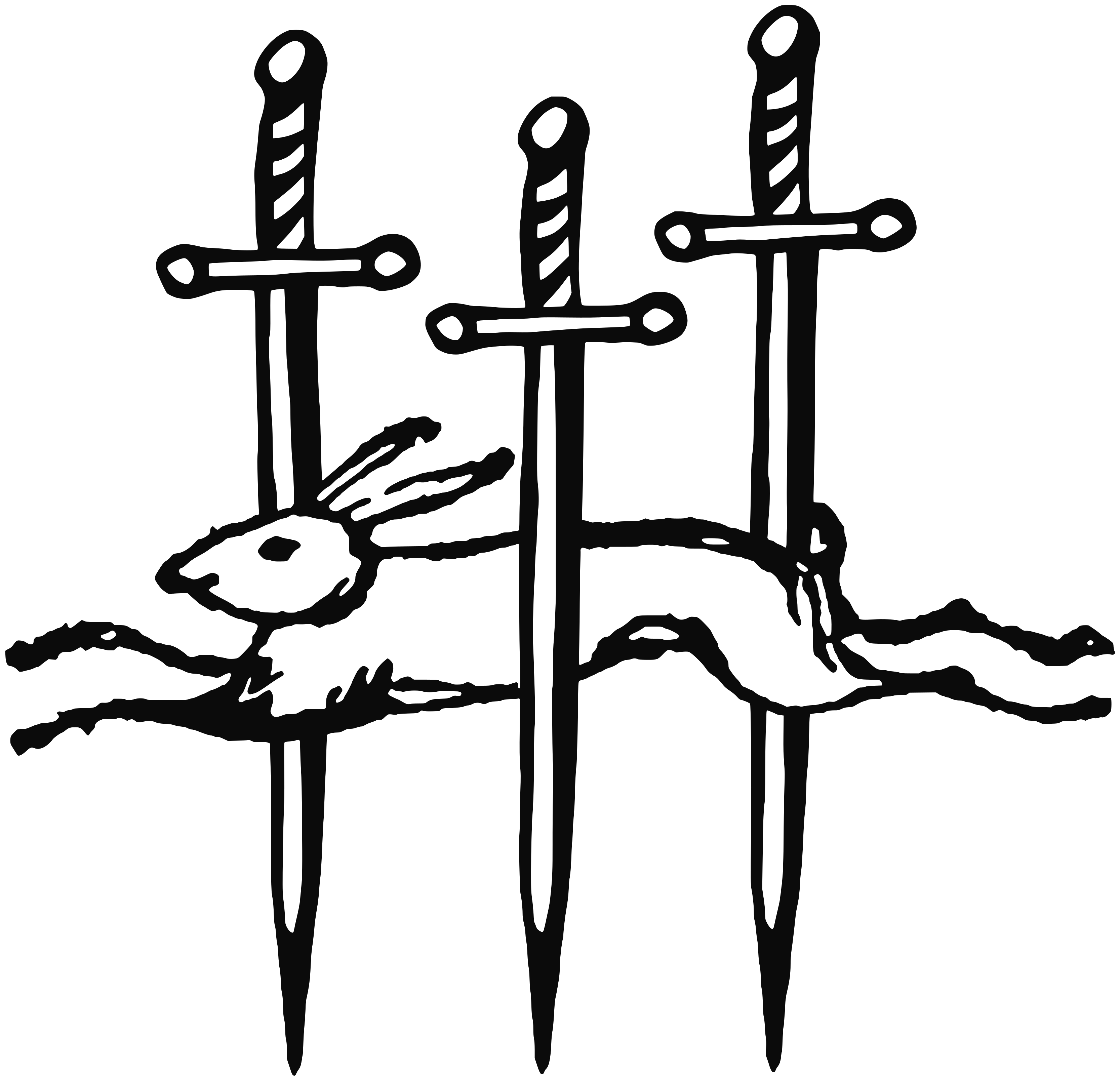
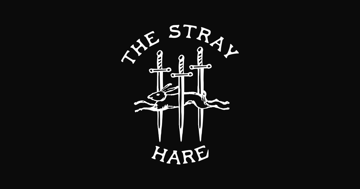
The hare and three swords with the arched name is the primary logo. It is hand drawn artwork, so always use the logo files. Never retype the name in a font or redraw any part of it.
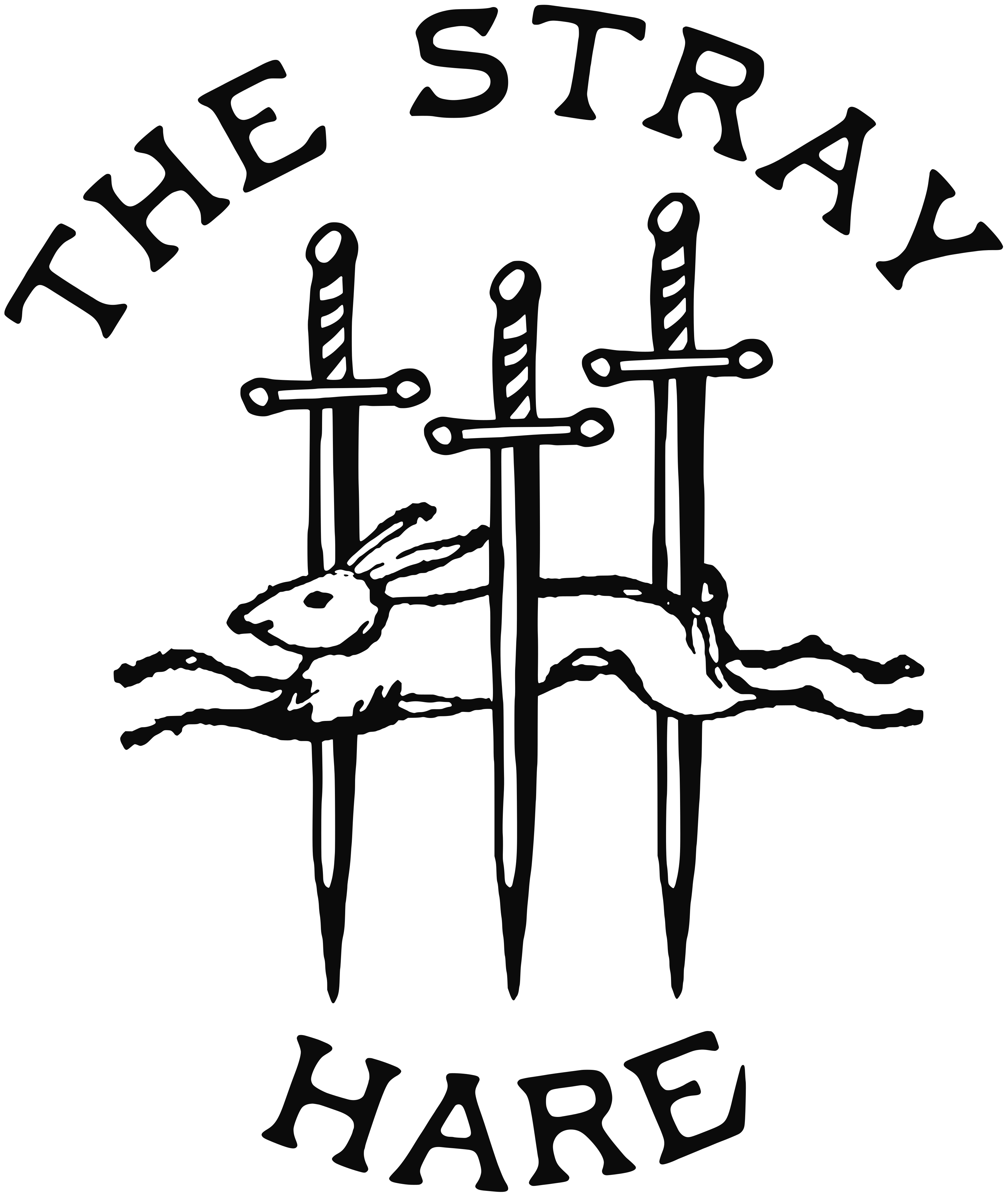


Use the full logo for signs, print and the website header. Use the hare and swords mark alone for small spaces like favicons, profile pictures and stamps.
Black on light backgrounds and white on dark backgrounds. No other colors, gradients or effects.
Leave clear space around the logo at least as tall as the letters in the name. Keep the full logo at least 1 inch wide in print and 60 pixels wide on screen.
Stretching, rotating, outlining or adding shadows to the logo, and placing it over a busy photo without a dark overlay.
Color
The palette is black ink on warm off-white paper. Every page on the website uses these eight colors.
#101010
Headlines, text, borders and dark sections.
#2E2C29
A second dark tone for depth on dark sections.
#57544D
Body copy and small labels on light backgrounds.
#8D8981
Small text on dark backgrounds only. Too light for text on paper.
#FBFAF6
Main page background and text on dark sections.
#F1EFE8
Alternate section background.
#E4E2DD
Quiet fills and photo placeholders.
#D2CEC4
Thin divider lines.
Typography
Four typefaces from Fort Foundry, each with one job. The lettering in the logo is hand drawn and is not a font, so do not try to match it with a typeface.
Cambridge Condensed
Regular 400, always uppercase, with slightly tight letter spacing. Used for page titles, section titles and service names. Prices use Semibold 600.
Cambridge Italic
Always an enjoyable time getting a haircut here.
Italic 400. Used for customer reviews and short quotes only.
Figure
The Stray Hare is a neighborhood barber shop on Frederick Street in Waldwick, New Jersey. Book online through Booksy or call the shop.
Regular 400 for paragraphs at 16 to 18 pixels with open line spacing. Semibold 600 for button text.
Grandway
Semibold 600, small, uppercase and widely spaced. Used for navigation, section labels, durations and form labels. Never used for full sentences.
Buttons and Links
Buttons are square, outlined in black, with a hard offset shadow. Button text is short and uppercase.
Light fill with a black outline. Used for the main action on a page, usually booking.
Transparent with a black outline. Used next to a primary button for the second option.
Uppercase label with a heavy underline. Used to point to another page from a section.
Writing and Photography
- Write in plain, complete sentences.
- Use American spelling.
- Do not use dashes. Use a comma or a period instead.
- Only mention services, prices, hours and policies the shop actually offers. Booksy is the source of truth.
- Write the name as The Stray Hare. Add Formerly Virile Barber & Shop where returning customers need to see it.
- Use real photos of the shop, the barbers and their work.
- Keep the light natural and warm. Avoid heavy filters.
- No stock photos, and no photos of people who no longer work at the shop.
- Resize photos to the size they will appear, 1600 pixels wide at most, before adding them to the website.
Logo Files
Use the SVG files for signs and print. They stay sharp at any size.